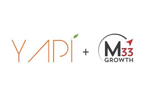
Today’s first taste of what’s to come from YAPI this year is very exciting for us, and we hope you enjoy this new look to our logo as much as we do.
Over the past decade, our company, which began in Southern California, has grown significantly thanks to our loyal customers. You’ll notice our trademark ‘leaf’ has a new bud (a buddy!) as a nod that we will continue to evolve, innovate, and grow our products for your needs.
YAPI is quite a unique name already, and now it is easier to read. A bolder font helps us stand out more - even without dental loupes! Since dentists see enough ‘caps’ already, we hope you also enjoy the change to lowercase.
Who knows YAPI more than our own team? This new logo was created by our own talented UI/UX team, and it aligns with the visual direction of upcoming changes to our product interface.
Our signature mascot, the YAPI puppy, will carry the torch of our pop of ‘orange’ - but now our environmentally friendly paperless dental software is reflected more accurately within dark gray and green hues. Thank you to all of our customers for being part of the movement that saves hundreds of acres of forests per year by going paperless with YAPI.
Are you not a customer of YAPI and curious to learn more about our software? Schedule a demo to see how YAPI can help automate the busy-work for your practice!